Showing posts with label still life. Show all posts

Friday, June 18, 2010

Fruits


MUNGYO Artist OP, 12' x 8' white paper.


I like to draw fruits, because of the combination of colors as well as the interesting surfaces on the fruits.

By sketching those fruits I learn that star fruit is really hard to draw. Because of the shape and the colors to express the 3Dness of the star fruit.

Well I enjoy painting orange, that is the reason I place the orange infront and hides the star fruit behind.

Saturday, September 19, 2009

Two Helmets


OP: MUNGYO
SIZE:8 inch x 12 inch
COLOUR: WHITE


I had posted this still life to Wet Canvas forum, one of the members comments that only guys will use helmets as the still life objects.

Sunday, March 15, 2009

The prawns are so delicious!

During the trip to Taiwan, I had ordered the prawn in one of the famous restaurant.


The prawns are so delicious!

MUNGYO OP on 12' x 8.5' white paper.

Sunday, February 1, 2009

Mandarin Orange

During the holidays at home for Chinese New Year Celebration, I collect some mandarin from relative, therefore it inspire me to sketch them on black paper.


I made a fast sketch on the object from top view.


I sketch another one on the same object, but this time, I place the mandarin on top of a silica tortoise ashtray.

Sunday, November 16, 2008

Green Apple

I always enjoy Yusuke's OP sketch, it is so real and lively. This is my first attempt on realism, it does helps me to train up my observation on colors, accuracy on sketching objects. I think I gonna do more realism sketch on still life.

Friday, November 7, 2008

Leisure sketch

I usually sketch my art by using color pencil consequently applying oil pastel. Yesterday, while waiting for the visit of my friend, I feel like having a leisure sketch. Therefore, I simple grab a piece of scrap paper left over on my desk and straight away sketch it with my Buncho oil pastel.

The first sketch object is my red helmet, which it is the first object that drags my attention. With no initial color pencil sketch, with no wasting time on choosing accurate color and measuring the object size, it took me about 5 - 10 minutes to finish the entire sketch.


As I looked at it that time, wow! it is not bad at all. So I decided to do another one, this time is my bonsai.


Out of sudden, I realized a problem! Hey! those papers are actually waited to be throw, now I have turn it into an art, It is a waste if I throw it away now.

With the success of those sketch, I picked a complex object for my next sketch. It is my bed that position near the window.


I finished up my scrap paper, but still I feel like doing another one. I found a piece of laundry receipt left on my desk, ^^ hehe.


It took me little time to sketch, but the outcome is astonish. I think I will do more leisure sketch in the future.

Sunday, October 26, 2008

Oil Pastel on Tracing Paper

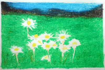
This is an experimental painting, I applied oil pastel on opaque tracing paper.

The initial painting looks like this:


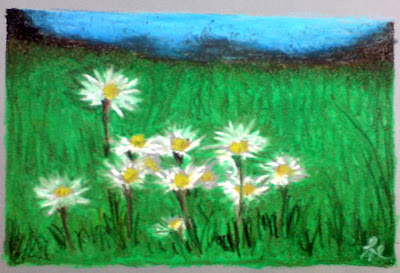
I realized that the smooth surface of the tracing paper is rejecting oil pastel from blending and layering, therefore with few strokes I finalized the painting. My intention is to make the daisy smile, good thing of tracing paper is, I manage to use tortillion to work out the daisy petals.


I think this is not so bad, I think tracing paper are suitable for oil pastel painting that does not rely on blending.

Saturday, October 4, 2008

ACEO Fruit series

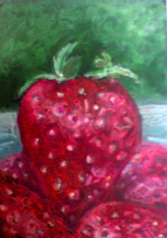
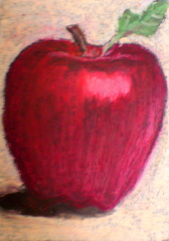
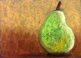
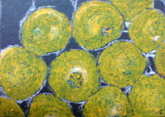
After the Pumpkins, I have done another four cards focus on fruits. I am using Cray-pas expressionist 36 colors on black mounting board.

Let me list all of them here.

#1 Pumpkins


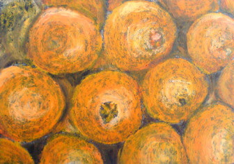
#2 Oranges


#3 Strawberry


#4 Apple


#5 Pear


All this while, I realized that certain color of OP doesn't blend well on my black mounting board, especially colors like yellow, light orange, they always appear transparent. I have discussed that in the forum and they have suggested me to do underpaint first before applying yellow, perhaps underpaint with other material such as oils, acrylics, or watercolor.

Look at the initial sketch of oranges, you may discovered that the orange color is transparent that leaves a lots of blackly scars.


Even after I have applied different tones of orange color on top of it, the scars still existed. In fact, I may always adapt the nature of the board and OP to express it as textures, but sometimes the scars are too much for certain surfaces, and they are no ways to cover entirely.

Friday, October 3, 2008

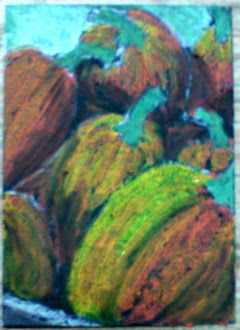
Pumpkins

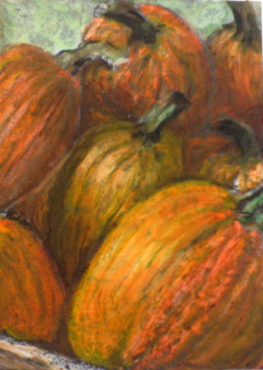
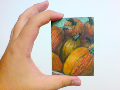
One of the October 2008 Oil Pastel challenge of WetCanvas forum is to paint pumpkins. Again, I decided to paint it on those left over ATC size black mounting board. I am using Cray-pas expressionist 36 color Oil Pastel.

This is the initial view.


I drew out the shape of pumpkins using white pastel pencil. After that, I blended it with 2 different tone of orange as well as yellow for the pumpkin's surfaces and "green gray" for the stem. Green gray is my favorite green, I find it blend very well on black mounting board. I am using "Sepia" for the pumpkin's shades. Sepia is my another favorite color, which gives dark brown that close to black color.

Here is the final view.


I use a lots of white to express reflection of lights as well as lighter shading. At last, I scatter with black, emphasizing darker shading.

Finally, I am done. Now I am holding it in my hand.

Link Within

Blog Widget by LinkWithin